← All work

B&Q / Castorama2016 — 2020Lead Product Designer

Store Operations Platform

Redesigning the colleague experience across Location Management, EPOS and device-agnostic roaming profiles — improving operational efficiency while prioritising accessibility and wellbeing.

-20%Click & Collect errors
600+Stores deployed
+28Colleague NPS
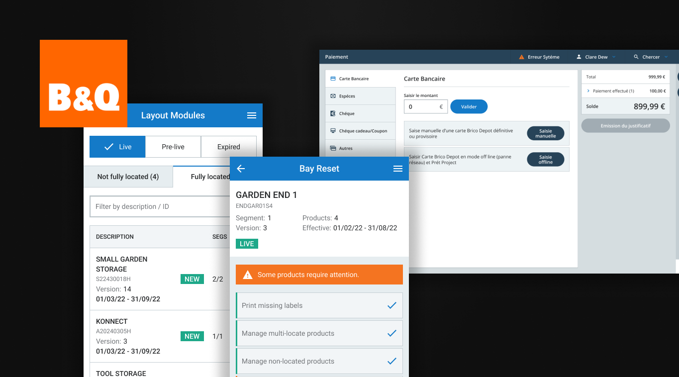
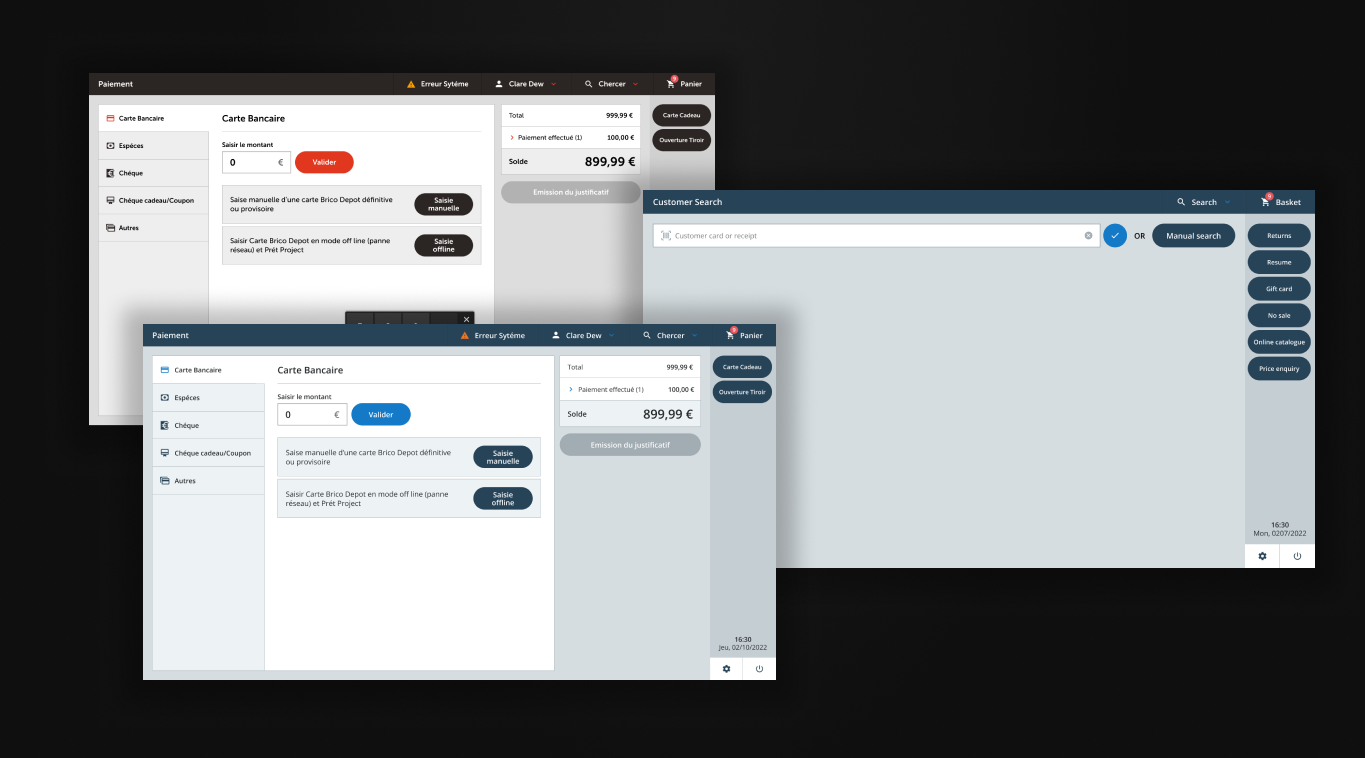
The B&Q logo, two location management screens and an EPOS till screen
Location Management, EPOS and roaming profiles across devices

The challenge

Disconnected systems on the shop floor

Business problem

B&Q and Castorama stores were struggling with inventory accuracy and order fulfilment. The existing systems were disconnected, leading to:

  • High Click & Collect error rates as online orders couldn’t be located in-store
  • Stock shown as “available” online but missing from shelves
  • Colleagues wasting time searching for misplaced inventory
  • Legacy EPOS causing checkout delays and training overhead

User problem

Store colleagues were the forgotten users. They worked long shifts on their feet, often in challenging lighting, using tools designed decades ago:

  • Bright screens causing eye strain and headaches on long shifts
  • No preference persistence — settings reset when switching devices
  • Small text impossible to read in warehouse lighting
  • Different interfaces for different tasks, constant context-switching

Designing for the shop floor

I worked with a couple of other product designers, a product owner, a business analyst, an on-site engineer and a third-party consultancy. I guided the design work, and led Location Management and the EPOS till design myself. I also took other disciplines into stores for user testing, so they could see the work through colleagues’ eyes, and showed how individual improvements solved problems for other teams.

01

User Research

Time in stores across the UK and France, shadowing colleagues and understanding the physical reality of their work.

02

Location Management UX

Designed the new system for stock allocation, bin locations and inventory tracking.

03

EPOS Redesign

Redesigned point-of-sale to reduce transaction time and training requirements.

04

Roaming Profiles

Designed a preference system that followed colleagues between devices and applications.

Process

From shop floor to solution

01

Contextual Research

You can’t design for the shop floor from a desk. I spent weeks in stores — early-morning stock takes, busy Saturday shifts, late-night inventory counts. It revealed problems no specification could capture.
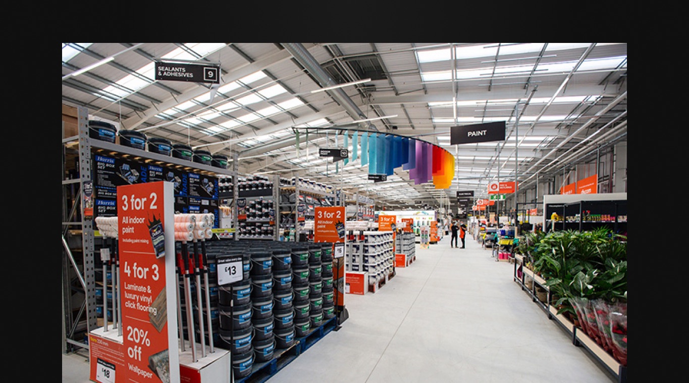
Field research inside a store

Store visits, colleague shadowing, environment analysis

Key decision

Dark mode for warehouse applications

Colleagues reported headaches after long shifts, and app feedback pointed to bright screens in dim warehouses. Product owners saw dark mode as a trend, not a business need. Those of us who had been in stores knew otherwise, so we reframed it around business benefit, such as reduced time to complete a task, and that got it released.

Outcome: Colleagues called out the dark theme in satisfaction surveys, and tasks took less time to complete.
02

Location Management

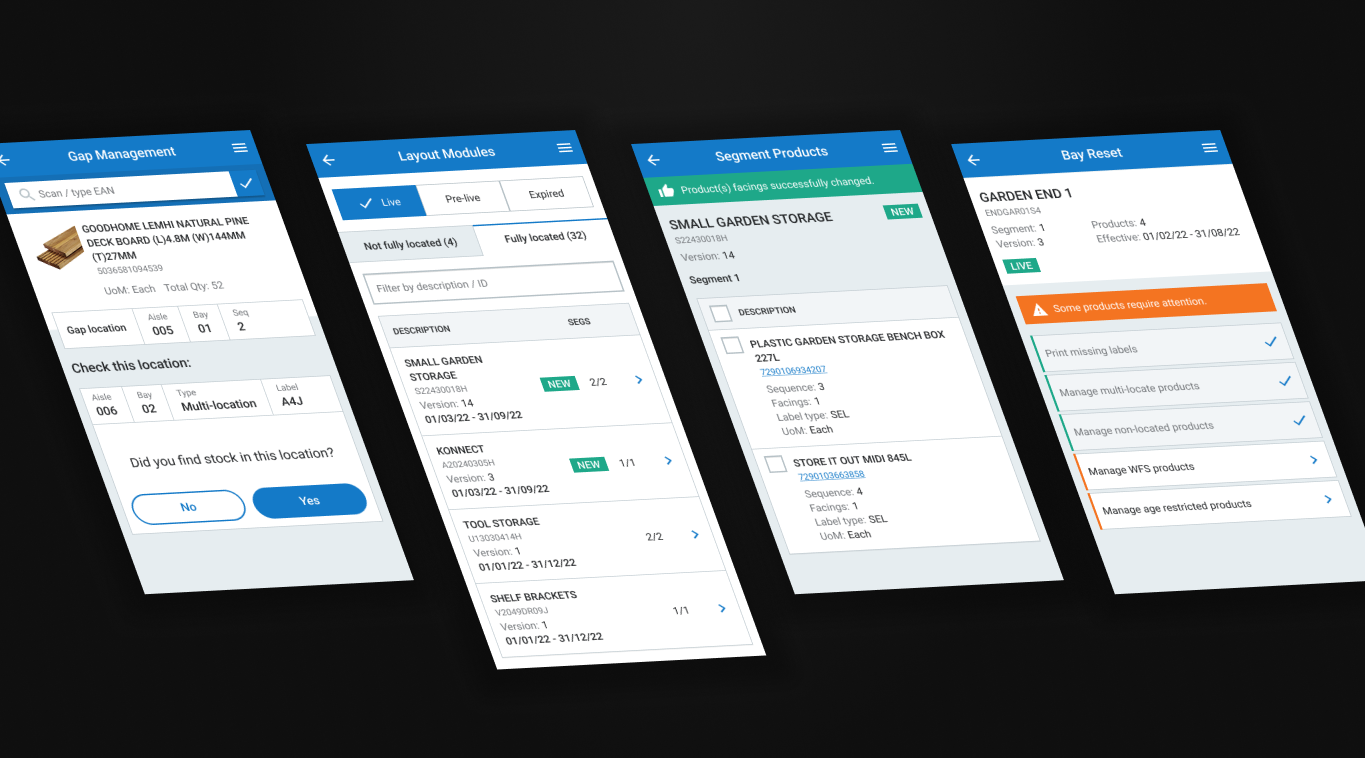
Every product needed a clear “home” — a specific bay, shelf and bin that both systems and humans could rely on. Colleagues could locate stock, move it and flag discrepancies, with real-time data feeding the website so online availability became accurate.

Location management screens

Bay navigation, bin assignment, stock movement

Key decision

Six menu options became one

Location journeys started from six options only seasoned colleagues understood. They all began the same way, so we merged them into one entry point.

Outcome: Faster onboarding for new staff and quicker location tasks.

03

EPOS Till Design

The existing EPOS required extensive training and still caused errors. We designed around the most common transactions, reducing cognitive load and making the happy path obvious.

Replacing a till system was the riskiest part of the work. Each business had its own legislation and payment options, so the design needed flexibility built in. We brought subject matter experts from all the businesses in for regular workshops and knowledge-gathering sessions. There were setbacks along the way, and getting that flexibility right was a real challenge.

Screens from the EPOS till

Transaction flow, product lookup, payment

04

Accessibility & Theming

Beyond dark mode: adjustable font sizes (including “extra large” for warehouse use), high-contrast modes and reduced motion.

Key decision

Roaming profiles across every store app

Colleagues pick up the nearest handheld and move between departments. Font size, theme, language and favourites followed them to every touchpoint.

Outcome: Accessibility settings travelled with the user.

Measuring what matters

The platform rolled out across 600+ B&Q, Castorama, Brico Dépôt and Screwfix stores, with measurable impact on operations and colleague satisfaction.

Business impact

-20%

Click & Collect errors

Accurate locations meant orders could be found.

600+

Stores deployed

Across B&Q, Castorama, Brico Dépôt and Screwfix.

-20%

EPOS training time

A simpler interface sped up onboarding.

User impact

6→1

Location menu options

One entry point for location tasks.

+28

NPS improvement

Colleague satisfaction with tools rose.

4

Settings that travel

Font size, theme, language and favourites.

Reflections

What I learned

Context is everything

Designing from an office would have missed the headache problem entirely. Time in the environment revealed what users had stopped complaining about.

Accessibility is operational efficiency

Dark mode and large text weren’t nice-to-haves — they improved task speed and reduced errors.

Bring other disciplines with you

When you’re deep in the work, it’s easy to forget that others haven’t had the same experiences. Taking them into stores built empathy, and taught me about pressures in their disciplines I hadn’t known about.