← All work

Kingfisher2018 — 2023Design Systems Lead

Multi-Brand Design System

Building a unified design language that scales across multiple platforms, products and international brands while preserving brand identity and accelerating delivery.

5Brands supported
60%Faster feature delivery
200+Components built
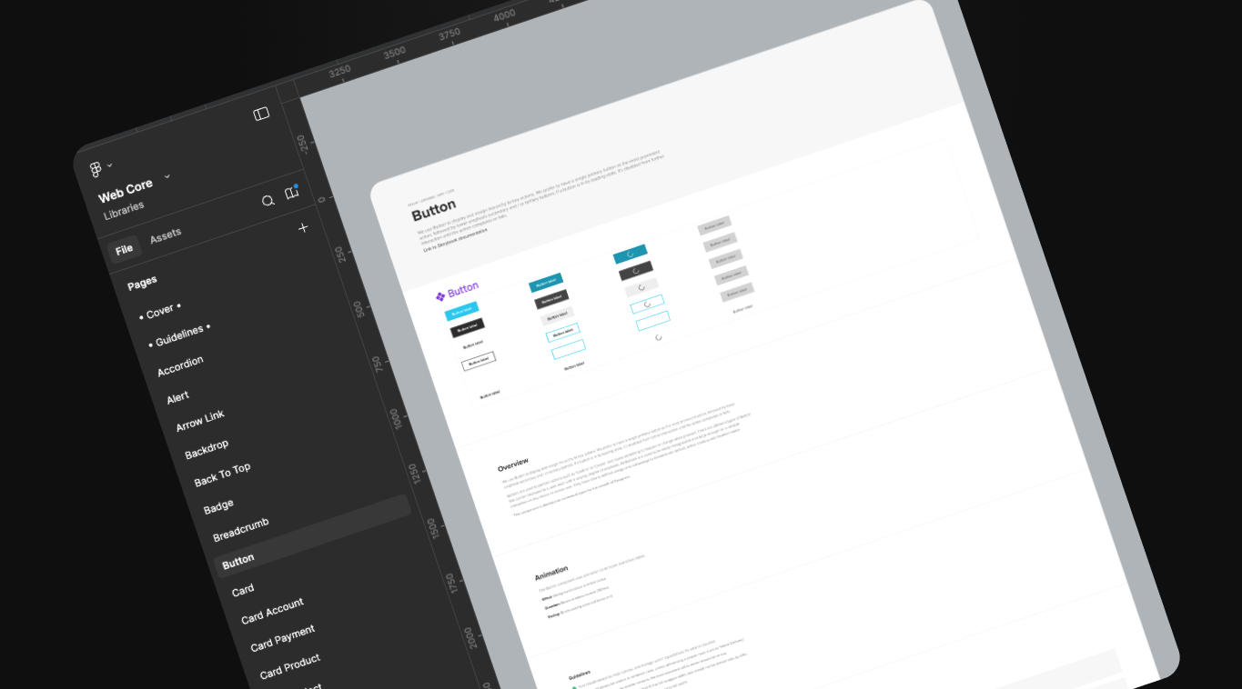
The Kingfisher design system documentation site showing the component library and token architecture
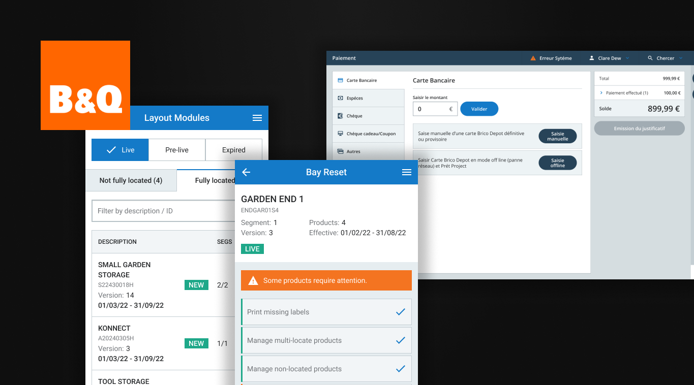
The unified component library serving B&Q, Castorama and Screwfix

The challenge

Fragmented experiences across the group

Business problem

Kingfisher operates multiple retail brands across Europe — B&Q in the UK, Castorama in France and Poland, and more. Each brand had evolved its own design patterns, component libraries and ways of working. This fragmentation meant:

  • Duplicated effort across teams building similar components
  • Inconsistent customer experiences within the same brand
  • Slow time-to-market as teams rebuilt foundational elements
  • Difficulty sharing innovations across the group

User problem

Customers encountered inconsistent interactions and visual language as they moved between touchpoints — website, app, in-store kiosks and colleague tools. This eroded trust and created friction:

  • Different button styles and interaction patterns across journeys
  • Accessibility varied wildly between products
  • Brand identity varied between touchpoints
  • A learning curve for customers using multiple touchpoints

From vision to adoption

The design system started as my idea. I pitched it early on, built proofs of concept and won the business buy-in to create a team. I took a product designer and an engineer under my wing and walked them through it: the steps, why they mattered and the business impact. I was very hands-on at first, across components, token architecture, developer handoff and code integration, then moved into a guidance and management role as they grew in confidence.

01

Strategy & Architecture

Defined the token architecture, theming approach and multi-brand strategy that let one system serve distinct brand identities.

02

Component Design

Designed core components with flexibility built in, so they could adapt to different contexts while staying consistent.

03

Governance & Process

Established contribution workflows, review processes and documentation standards that enabled teams to extend the system.

04

Adoption & Advocacy

Worked across teams and geographies to drive adoption — workshops, migration guides and internal champions.

Process

Building for scale

01

Proving the idea

Design systems weren’t widely talked about at the time, so the first job was showing why this one was worth doing. We started with a code concept only, then ran many proofs of concept, and moved from Sketch to Figma along the way. That work earned the buy-in to create a team.
02

Audit & Discovery

Before building anything new, we needed to understand what existed. I led an audit across all brands and platforms, cataloguing patterns, identifying inconsistencies and finding opportunities for consolidation.

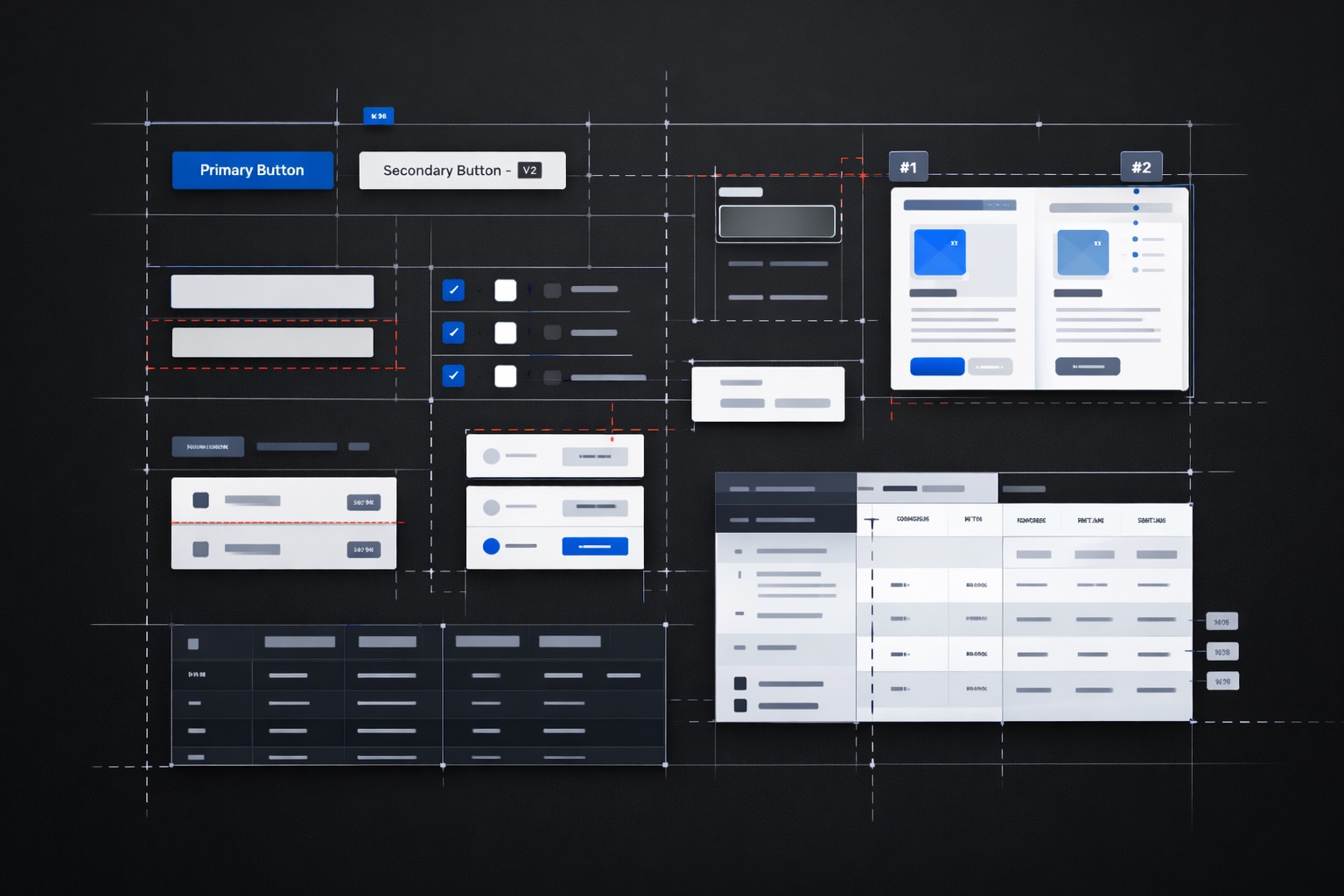
A UI audit comparing every instance of a component

Pattern inventory, inconsistency mapping, consolidation opportunities

Key finding

We discovered 47 different button variations across products. Most could be consolidated into 8 variants without losing necessary flexibility.

03

Token Architecture

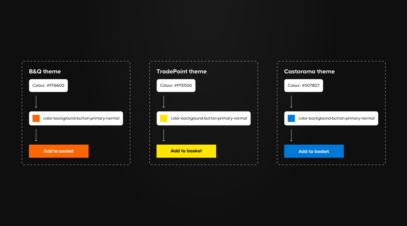
The foundation of a multi-brand system is its token architecture. We designed a two-tier token system: primitive tokens (raw values) and component tokens (specific applications) — a reflection of the organisation’s design system maturity at the time.

Two-tier token architecture diagram

Two-tier architecture and brand theming

Key decision

One component, many brands

Primitive tokens held each brand’s raw values, and component tokens applied them, such as color-background-button-primary-normal. B&Q’s orange and Castorama’s blue could fill the same button without changing component code.

Outcome: Brand theming became a configuration change, not a rebuild. New brand onboarding dropped from weeks to days.

04

Component Library

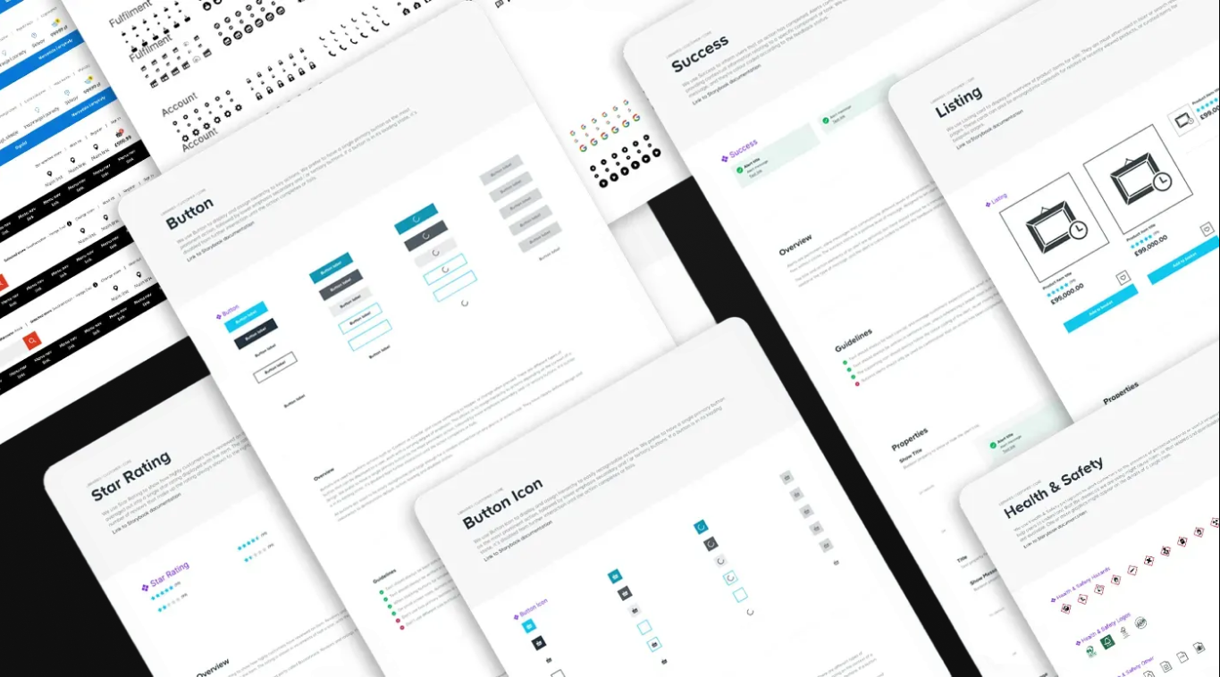
With tokens in place, we built the component library. Each component was designed to be composable, accessible by default and flexible enough to handle edge cases without breaking patterns.

Component library overview

Composable, accessible-by-default components

05

Governance & Documentation

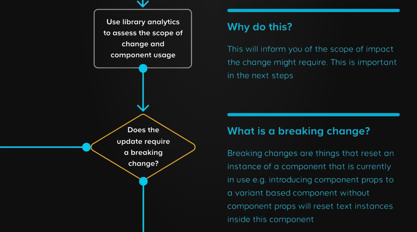
A design system is only as good as its adoption. We created documentation, contribution guidelines and a governance model that balanced consistency with team autonomy.

Contribution and governance process

Contribution model and documentation

Key decision

Federated contribution model

Rather than a central team owning every component, any team could propose and contribute through an RFC process. The core team became curators and quality gatekeepers.

Outcome: Contribution rate increased 3×. Teams felt ownership over the system, improving adoption.

06

Winning over eCommerce

The eCommerce website team was the hardest to win over. It had many product owners, competing priorities and deadlines, and retrofitting a system into a working platform was seen as a luxury, not a necessity. We got there slowly, by showing the impact on teams that had adopted it, mainly Store Operations. From idea to embedding took an exceptionally long time.

Measuring what matters

Design systems succeed when they deliver value to both the business and the end user. We tracked metrics across both.

Business impact

60%

Faster feature delivery

Less time on foundations, more on product differentiation.

3→1

Codebases consolidated

Brand-specific libraries merged into one shared system.

85%

Adoption rate

Of active products within 18 months.

User impact

AA

Accessibility compliance

Every component met WCAG 2.1 AA, some reaching AAA.

47→8

Button variants

Simpler patterns meant faster learning.

+12%

Task completion

Consistent patterns reduced cognitive load.

Reflections

What I learned

Systems are about people, not components

The hardest part wasn’t designing components — it was changing how teams worked. Success took as much change management as design.

Bring engineering in sooner

I’d befriend engineering more, and earlier. The benefits to them were huge, and that department was bigger than ours. We needed them more than we first realised.

What I’d change now

The version we built had no semantic tokens. That was a learning for me: I now use them in all my projects, and I’d add them if I revisited this one.